Étude de cas en développement. Restez à l'affût!
MANDAT
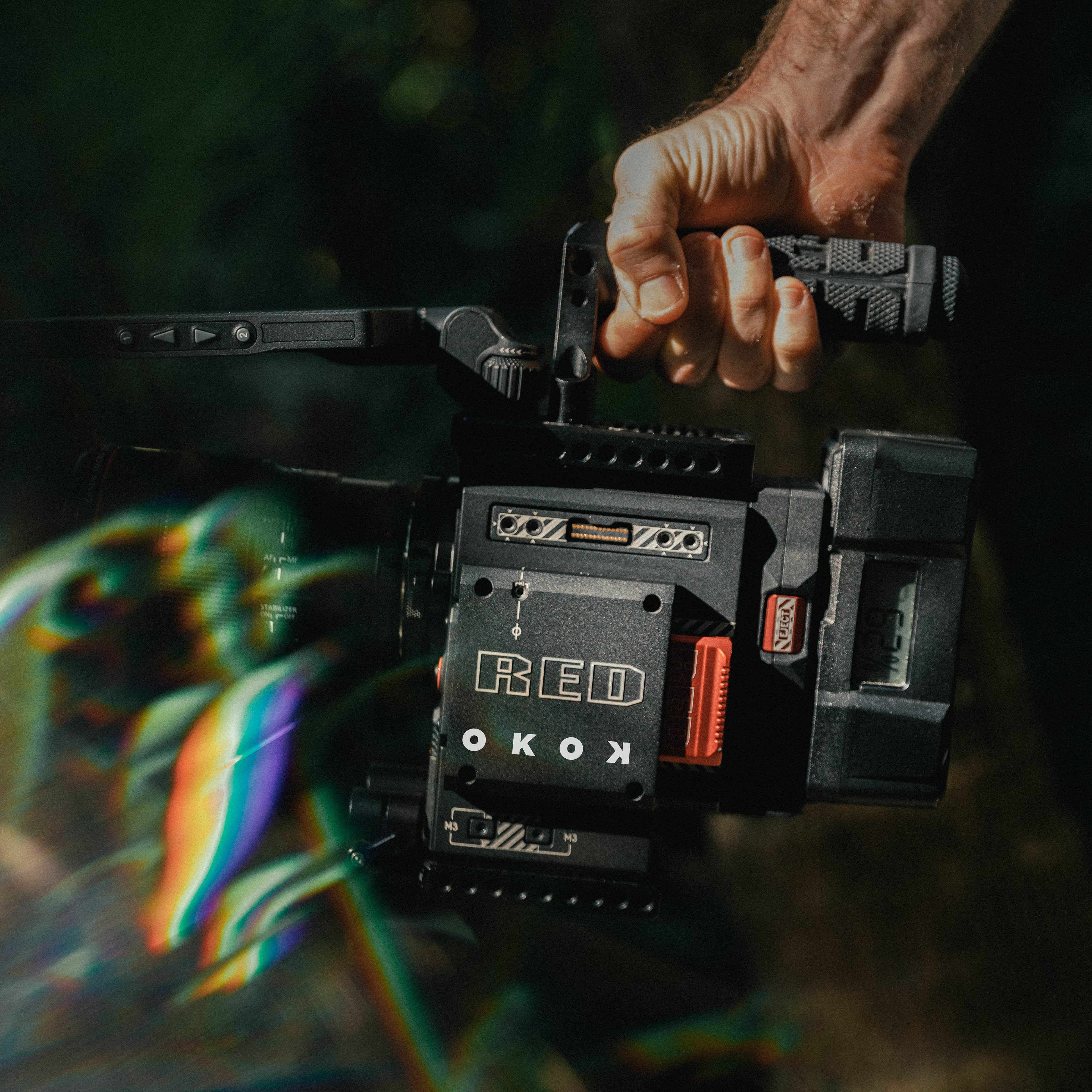
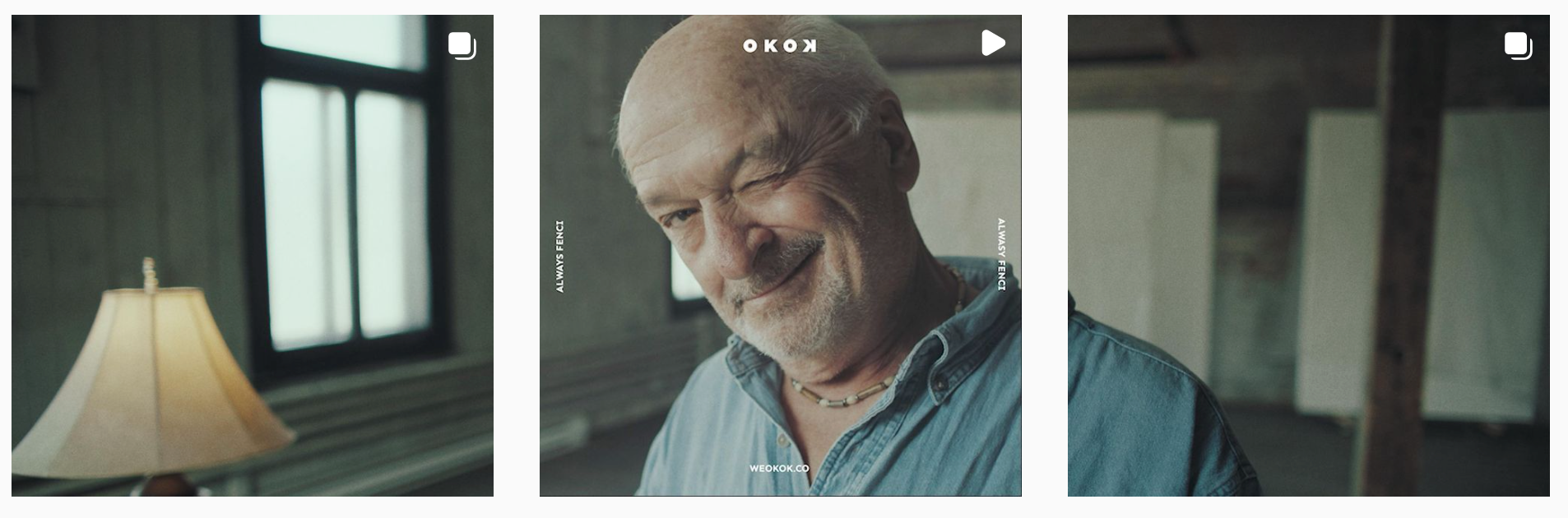
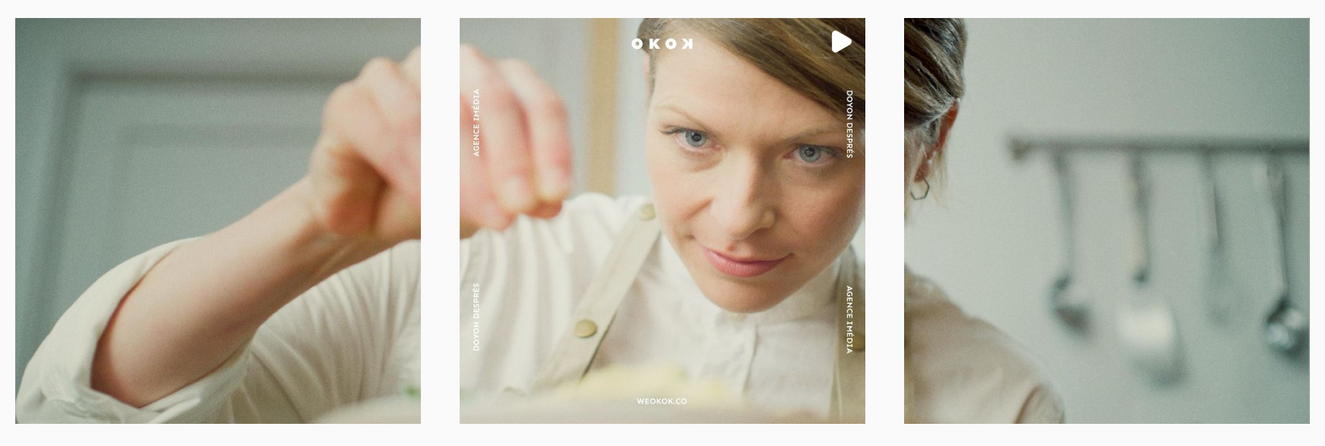
OKOK est une production vidéo menée par des jeunes passionnés dans le domaine du filmmaking, spécialisés dans les vidéos de sports extrêmes, vidéoclips musicaux et dans le contenu de marque publicitaire. Ils m'ont contacté afin de créer un logotype reflétant ce qui se dégage de leur travail; simplicité et minutie.
I wanted to represent the qualities of the brand, driven by passionates in the filmmaking world, specialized in action sports flicks, videoclips and branded content for advertising in the music, outdoors and advertising industry.
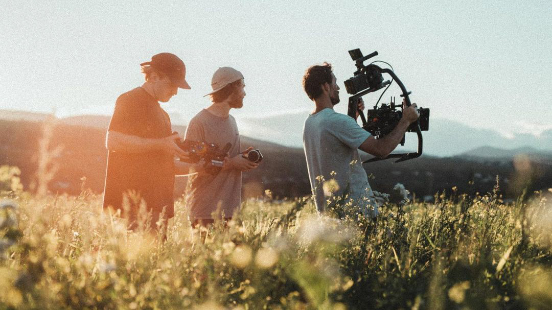
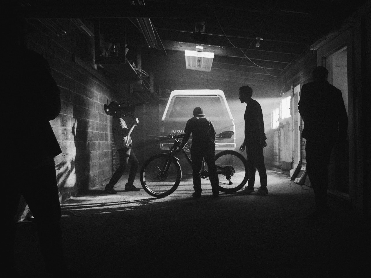
crédit photos: @weokok.co
Sémantiques / SEMANTICS
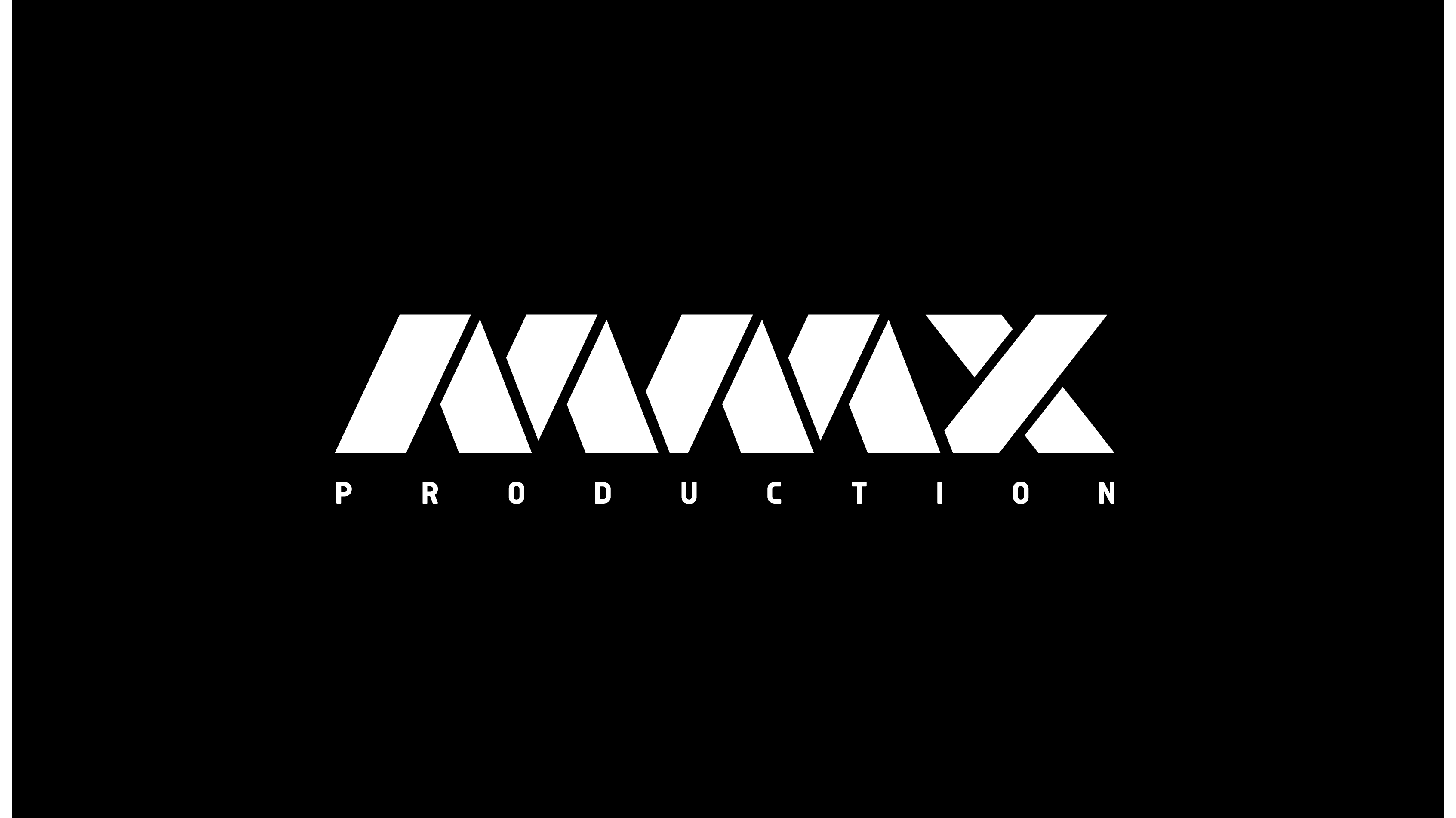
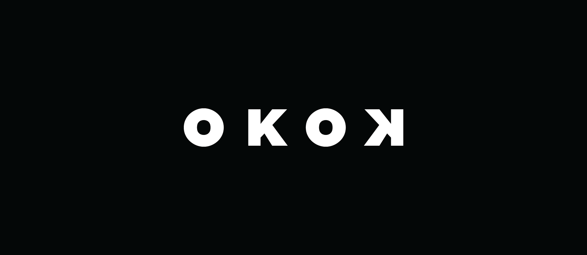
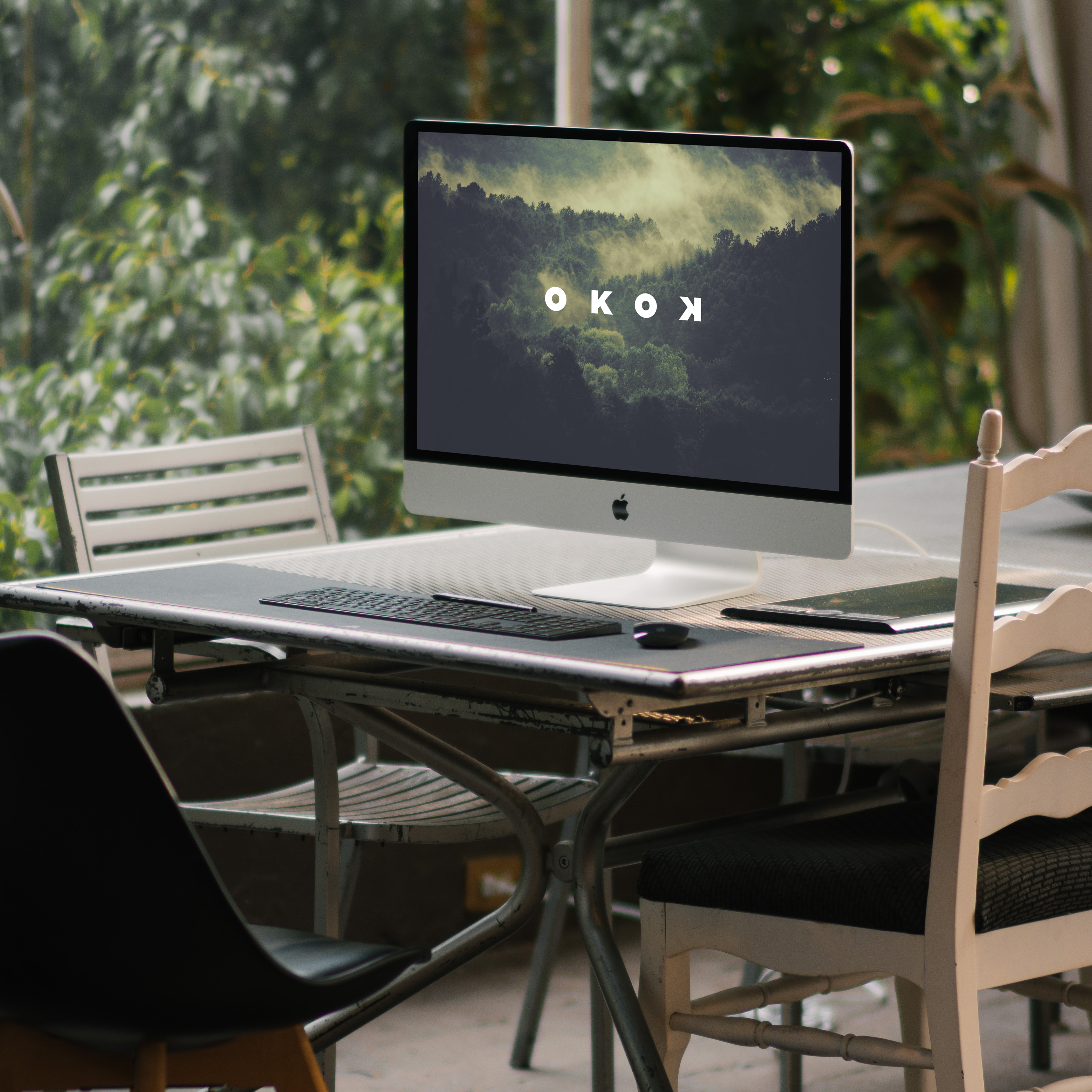
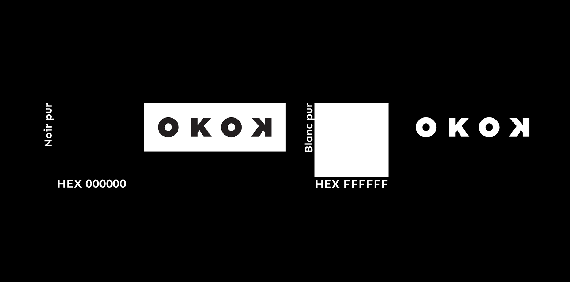
Les gars s'affichent sous le nom de OKOK, un mot universel utilisé afin d'approuver quelquechose et de se mettre à l'action. Le logo et l'identité devaient communiquer leur spécialité, tout en restant simples et sensés. En usant les lettres «k» ainsi que le «o», j'ai pu représenter les icônes de recul, enregistrement et avance rapide utilisées sur des caméras. L'ensemble forme un oeil avec le «o» centré, un indice lié à leur minutie et leur catégorie.
They go under the name of OKOK, a universal word used for approval and get to action. Their logo and identity had to absolutely reflect their focus in the simplest yet communicative matter. I played with both "k" and "o" letters to represent the rewind and fast forward buttons universally recognized and in their actual position, also forming an eye with the “o” in its centre, hinted at their attention to detail plus being also known for the rec button.
TYPOGRAPHIE ET COULEURS / COLORS AND TYPOGRAPHY
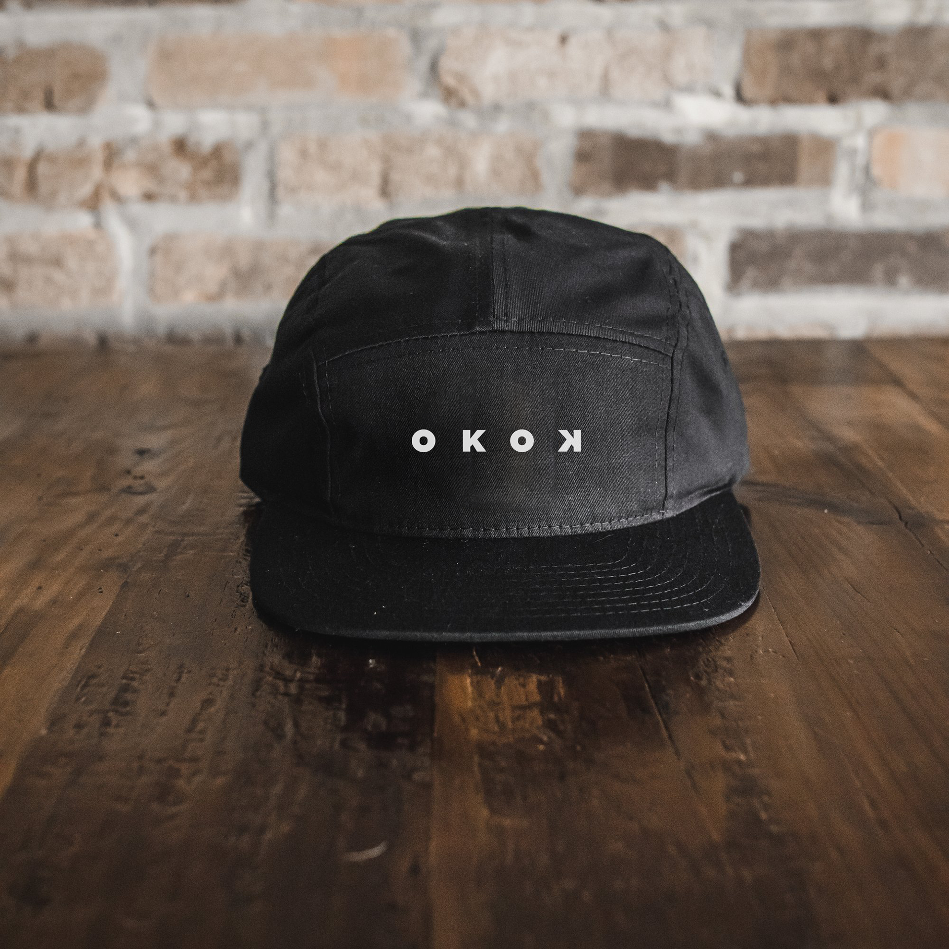
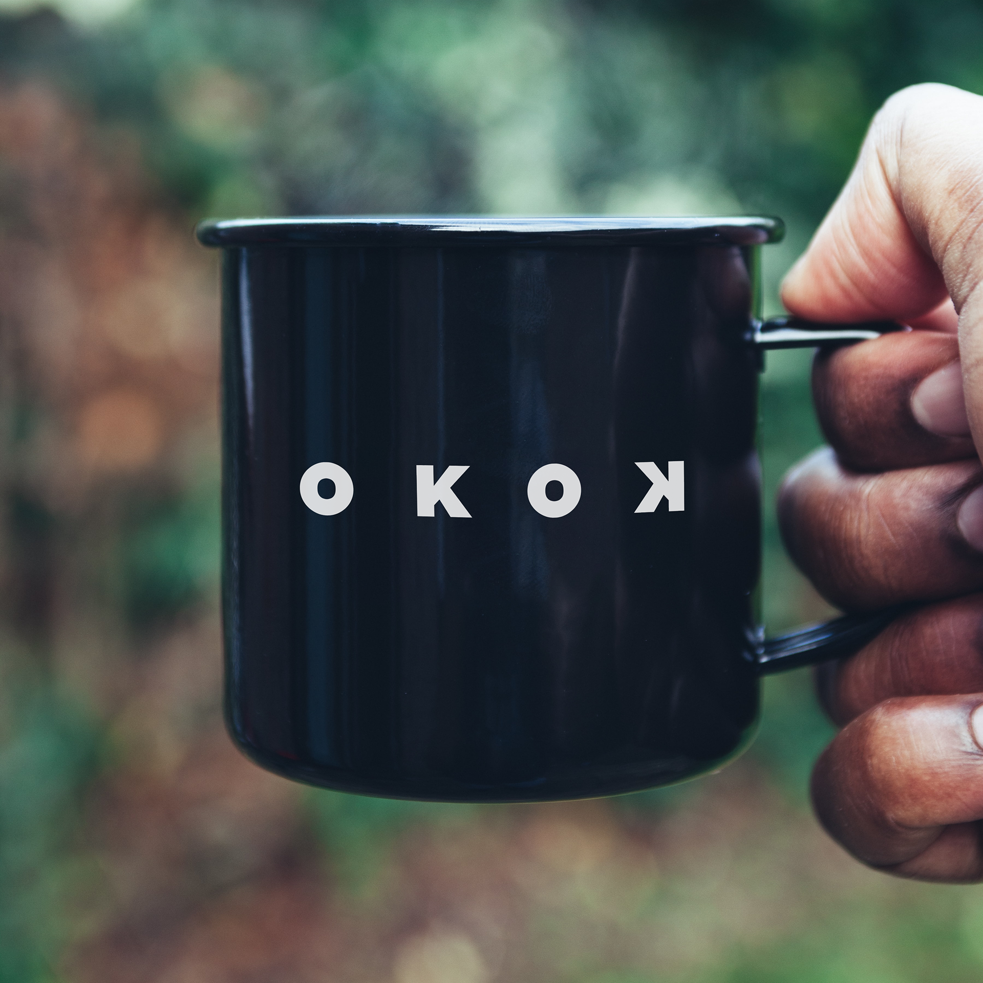
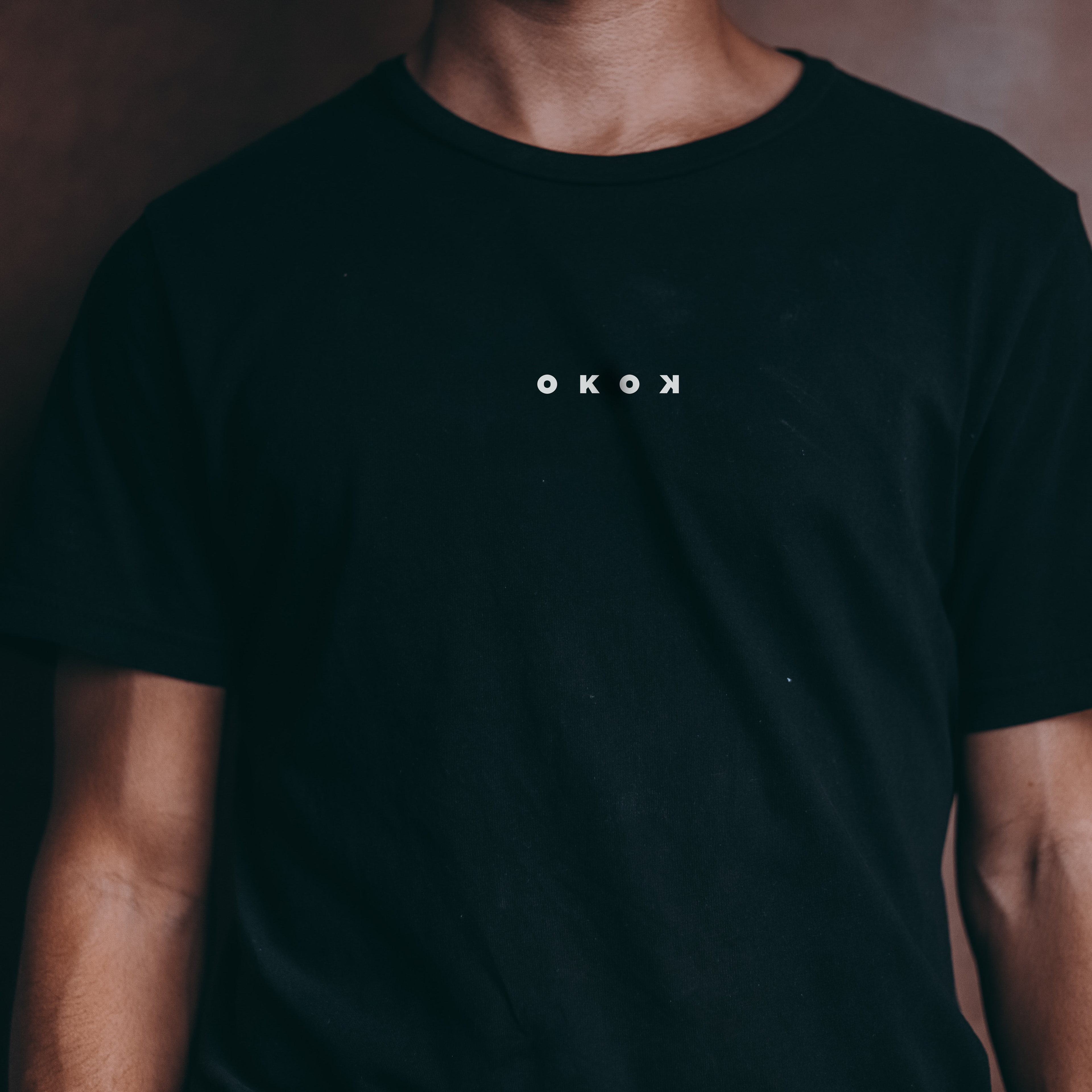
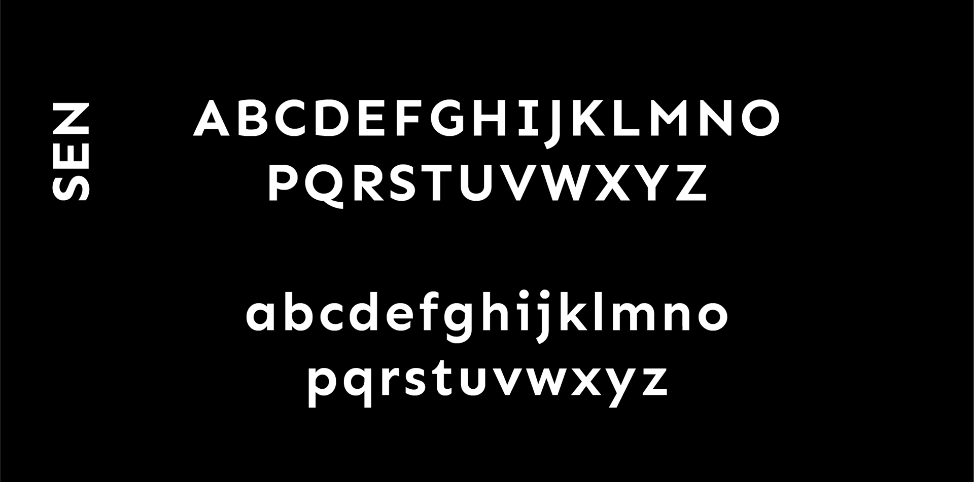
La typographie devait bien cohabiter avec le logotype et l'ambiance des communications de l'entreprise, principalement sur les réseaux sociaux d'où pourquoi la typographie «Sen», une typographie affirmée et légère dans des lignes et courbes complémentaires au logotype. Nous avons établi une palette de couleur très simple pour ne pas voler la vedette à leurs réalisations; soit le blanc et le noir pur.
The typography had to get along well with the logotype and the whole brand communications, principally on social networks. Thys why I went with "Sen", a firm as light typography going pretty well with the personality of the logotype. We also remained calmed in the colors palette which remains in pure black and white, leaving room for their productions to shine.
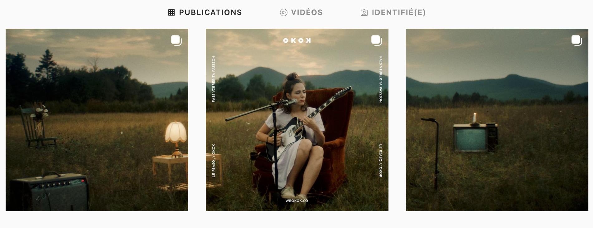
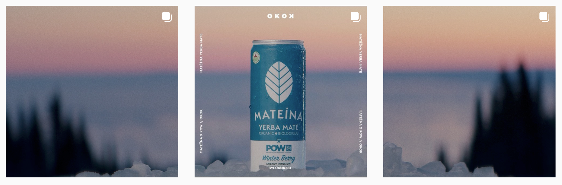
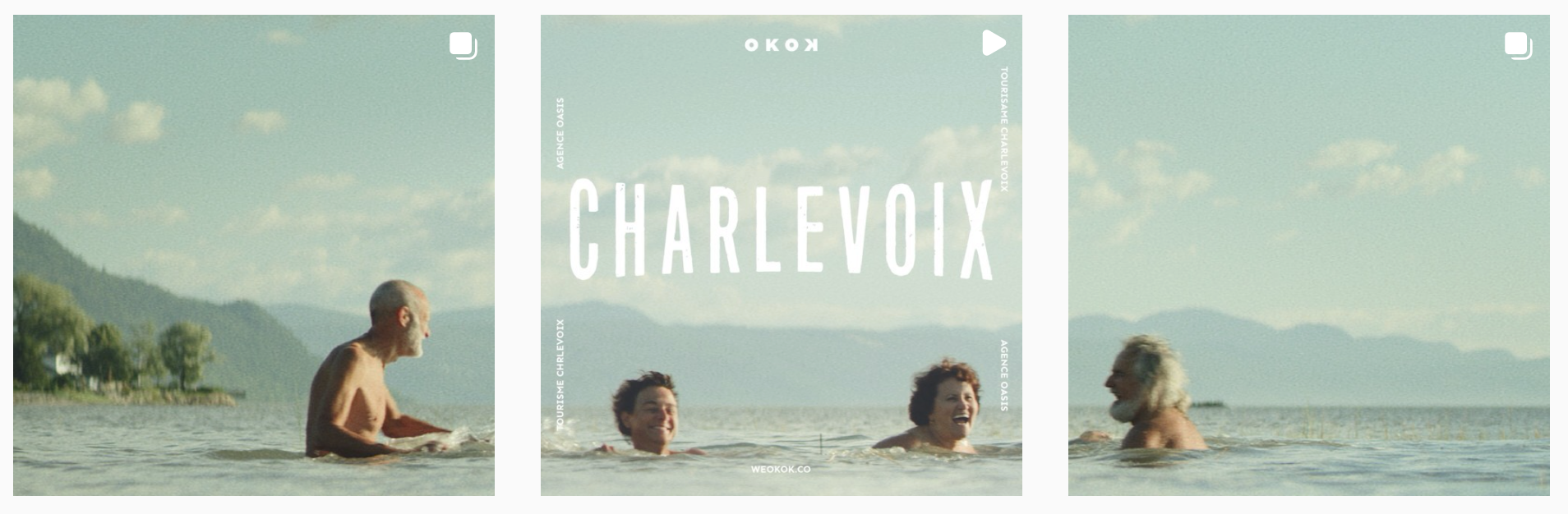
crédit photos: @weokok.co
Merci / THANK YOU
Visionez le déploiement du brand actuel et leurs dernières réalisations au:
Peep at the brand outcome and their latest work at: